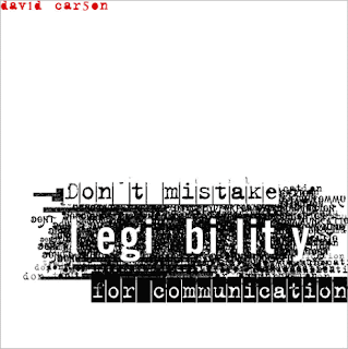
Don't mistake legibility for communication

This is a piece from David Carson. Since we just studied digital design in class, I was interested in seeing more of David Carson’s work. Just looking at images on Google, this one jumped out at me as representing his ideas on design. He uses type to evoke emotions. He makes the viewer work for the message. In this composition, he overlaps various typefaces in a black mass. Looking at the less dense areas, one can determine that he is stating his message (Don’t mistake legibility for communication) over and over again. On top of the mass of text, he obviously states his message using positive and negative text images. In the composition, the use of white space and the placement of his name in red at the upper left-hand corner is very appealing to me. His use of text as image is very much in the digital style. The typeface for his name, Don’t mistake, and for communication is a serif font reminiscent of an old-time typewriter perhaps Courier. The typeface for legibility is a simpler font but still a serif (I am assuming this from the letter “g”). The idea that communication and legibility are not mutually exclusive is one that I am just beginning to realize - the lines between text, art, and communication are blurred in this digital age.

No comments:
Post a Comment