I've always been interested in the creative process. Space, lines, contour, page layout, fonts - I love fonts! Taking a graphic design history course seems a great way to learn about how design has evolved. Can't wait to learn more and develop my style by looking at history.
Saturday, November 20, 2010
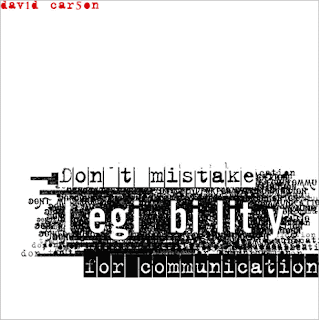
Don't mistake legibility for communication
Saturday, November 13, 2010
Freedom of Religion
 This poster was designed for Amnesty International (a human rights organization which fights to free prisoners of conscience). The poster is a tool used by the organization to educate the public on the topic of Freedom of Religion from their Universal Declaration of Human Rights. As I was looking through Woody Pirtle’s website, I noticed several layouts that he did for Amnesty and this one caught my eye. This piece is highly influenced by the Swiss International Style. The layout is on an obvious grid and the font is a san-serif style - probably Helvetica. The use of various weights and sizes of types, the ninety-degree rotation of the title “Freedom of Religion” and “Article 18”, and the enlargement of object photographs were all commonly used by Swiss practitioners. The filtered image of the candle and flame is a universal representation of religion, hope, and freedom.
 The candle is also part of Amnesty International’s logo. In the logo, however, the candle is surrounded by barbed wire which represents the suppression of human rights.
I think this poster is a highly effective, persuasive piece of graphic art.
Sunday, November 7, 2010
Clockers
This is the movie poster from the 1995 Spike Lee film Clockers. The poster was used to advertise the movie when it came out but now the artwork serves as the cover of the DVD. Although his films can be violent and disturbing, Spike Lee is one of my favorite directors because of his poignant social commentary. I was looking for a movie on Netflix and this caught my eye for two reasons. First, I haven’t seen this particular Spike Lee movie (and this I must remedy). Second, I am studying Saul Bass for my influential designer presentation – it reminds me of his movie poster for Anatomy of a Murder - more on this later…
The typography is reminiscent of an old-time typewriter. The letters are blotchy and smudged and of different thicknesses which add to the typewriter-ish feel of the title. I like the staggered lettering style and the lower case “e” used. The artwork is a body constructed of simple shapes in flat black color straddling color-blocked background (white & red). I have always been attracted to simple, uncluttered designs. I like white space. I like a piece to breath. This piece breaths in a late modern, Saul Bass kind of way.
Now for Saul Bass' poster for Anatomy of a Murder.
Subscribe to:
Comments (Atom)


