Sunday, December 12, 2010

Inspiration

Inspiration?  It is elusive at times, abundant at others, always a state of mind.  What inspires me? Graphic artists that changed the world, altered the look of design, spoke out for social change, inspired so many: William Morris, Jules Cheret, A.M. Cassandre, Josef Müller-Brockman, Saul Bass, Milton Glaser, Tibor Kalman, David Carson, April Grieman, and so many more. These were some of the innovators, pioneers of their times - went beyond the norm, embraced new technology, and created a new style of design – changed the world.  Inspiration?  Yes.  For me, the ability of these artists to change society through their work is an inspiration, of course.  Who wouldn’t admire the people who impacted our world for the better especially since graphic design is so prevalent in our lives?  This is the big picture – big inspiration – big change.  But for me, right now, the simple is inspiring - text perfectly placed on a page; a well-balanced composition; beautiful color combinations; simple, geometric imagery or photography; and reflection of the mood of the piece.  Works of art done by some of the very designers that created the big picture?  Yes. My inspiration…
The idea of a simple, well-balanced, layout without excessive ornamentation was promoted by the Swiss-style designers, late-modernists, and is still carried out by contemporary designers today. 


The 1975 poster by Josef Müller-Brockman entitled “akari” is an advertisement for an exhibition in Germany for a Japanese light company (Akari).  This is simplicity at its finest, the beautiful circle of light and its reflection, the four-column grid layout of the text which includes the simple title (all lower case, Helvetica), and the simple black background. 


The work of late-modernist and contemporary designer Saul Bass for the film Spartacus (1960) is also a simple composition that motivates me to create.  The geometric text; the artfully-drawn, abstract image; the simple & powerful color-scheme; and the white-space make this poster an amazing visual representation of the movie and man portrayed.


Work of contemporary designer Woody Pirtle is a great inspiration to me.   I like that he uses simplicity to advocate for social change.  In 2002, he was commissioned to design a series of posters for Amnesty International to represent “The Universal Declarations of Human Rights.”  This particular poster is a plea for “Freedom from Discrimination.” Again, the simplicity of the design is appealing to me.  The concept is amazing - using crayons to represent the races of humanity then removing the color and washing them with flat color to represent equality.  Very strong imagery and symbolism.  The minimal text block in varying weights of Helvetica, the vertical title, and Article 02 add to the powerful nature of the piece.


Why is it important to me to be able to convey key messages in a simple, well-constructed design? The old saying “A picture is worth a thousand words” has been thrown on its head in this digital world.  Just go to any website, we are bombarded with imagery, advertising, flashing reminders that we need to refinance, lose belly fat, find cheaper long distance.  The messages are confounded, lost in a vibrating blur.  Just driving down the highway, billboards speed by and offer us solutions to our needs – drink Jack Daniels and feel good, shop at Macy’s and you’ll look like this gorgeous model, get your McLatte at McDonalds TURN HERE!  Too much, too fast.  But when I see a simple, well-composed, poignant design, the message strikes me with such clarity.  In this world, where people are overloaded with information, we don’t spend enough time looking at one thing – in fact, we spend a lot of time ignoring the abundance of information presented by our surroundings.  The ability to convey the message with clarity, beauty, and straightforwardness is even more important in this time of information overload.

What will I do next?  I hope to learn through taking more graphic design classes and observing the world around me.  I am sure that my tastes will change over time.  Just taking my first graphic design class has changed my view on design, art, history, and how entwined they are.  How history changed design and how design changed history.  I will take classes, make observations, read, study, and learn with an open mind.  Will my inspiration change?  Probably.  Will I appreciate new design styles? With anticipation.  Will I still value text perfectly placed on a page; a well-balanced composition; beautiful color combinations; simple, geometric imagery or photography while reflecting the mood?  Absolutely.

“Art washes from the soul the dust of everyday life.” -- Picasso

Saturday, December 11, 2010

just bounce it

I love this Nike ad by Neville Brody - especially his use of typography.  After some of my classmates did a presentation on the digital era and Neville Brody specifically, I became interested in his work.  I started searching on the web for examples his designs and this appealed to me. It is obviously an advertisement to sell Nike shoes using a twist on their famous Just Do It campaign. The design is definitely digital in its treatment of the text and artwork.  The word bounce looks like it is bouncing and slam it & smash it are vertical on the page – kind of like visual onomatopoeia.  The text (Helvetica) is overlapped and various type sizes & colors are used to emphasize the words.  For example the text that is on the photo is white & large and it changes abruptly (in the middle of the u) to black at the edge of the photo.  This is in contrast to the backgrounds (black to white and white to black). The entire ad is basically in black and white except the words just zap it (superimposed on the picture), a little portion of the bottom of one of the shoes, and the Nike logo which are in red.  The red balances out the page, accentuates the colored text, and leads the eye to the Nike logo.  The tightly cropped photo of a woman’s face shows passion and the strength.  I love the balance of large & varied text and the powerful, intense photo.  It really works even though the shoes play a surprisingly small role in the advertisement.  This ad is selling shoes but it is also selling an athletic lifestyle – effective as well as artistically edgy.

Saturday, December 4, 2010

44 Obamas

This is a piece from Peter Max called 44 Obamas.   He created the piece to celebrate the inauguration of President Obama in January of 2009.  I have seen this artwork several times throughout Obama’s presidency on the news and at various websites.  I also read an article about Peter Max and his pride in our President and our country.   Max is a pop artist who started painting during the 1960’s psychedelic period and has continued his career through the present.  In the article, he discussed his creative process and how he created this specific piece.  He started with two different pictures of Obama, picked up his brush, asked his DJ to turn up the music, and started painting.  He created each individual picture independently and assembled them into the montage which is 15 feet x 6 feet (4 rows by 11 columns).  There is no typography in the piece but the artwork is amazing.  The idea of alternating two different pictures makes the montage very dynamic.  The colors are bright and contrasting in some of the pictures and somewhat muted and monotone in others adding to the dynamic nature of the piece.  I was initially attracted to the brightness of the composition and the positive image that it creates of President Obama.  Upon further inspection, I see that each individual picture is a work of art in itself and that the total is even bigger than the sum of its parts due to the dynamic nature of the design. 

Saturday, November 20, 2010

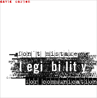
Don't mistake legibility for communication

This is a piece from David Carson.  Since we just studied digital design in class, I was interested in seeing more of David Carson’s work.  Just looking at images on Google, this one jumped out at me as representing his ideas on design.  He uses type to evoke emotions.  He makes the viewer work for the message.  In this composition, he overlaps various typefaces in a black mass.  Looking at the less dense areas, one can determine that he is stating his message (Don’t mistake legibility for communication) over and over again.  On top of the mass of text, he obviously states his message using positive and negative text images.  In the composition, the use of white space and the placement of his name in red at the upper left-hand corner is very appealing to me.  His use of text as image is very much in the digital style.  The typeface for his name, Don’t mistake, and for communication is a serif font reminiscent of an old-time typewriter perhaps Courier.  The typeface for legibility is a simpler font but still a serif (I am assuming this from the letter “g”).  The idea that communication and legibility are not mutually exclusive is one that I am just beginning to realize - the lines between text, art, and communication are blurred in this digital age.

Saturday, November 13, 2010

Freedom of Religion

This poster was designed for Amnesty International (a human rights organization which fights to free prisoners of conscience).  The poster is a tool used by the organization to educate the public on the topic of Freedom of Religion from their Universal Declaration of Human Rights. As I was looking through Woody Pirtle’s website, I noticed several layouts that he did for Amnesty and this one caught my eye.  This piece is highly influenced by the Swiss International Style.  The layout is on an obvious grid and the font is a san-serif style - probably Helvetica.  The use of various weights and sizes of types, the ninety-degree rotation of the title “Freedom of Religion” and “Article 18”, and the enlargement of object photographs were all commonly used by Swiss practitioners.  The filtered image of the candle and flame is a universal representation of religion, hope, and freedom.
The candle is also part of Amnesty International’s logo.  In the logo, however, the candle is surrounded by barbed wire which represents the suppression of human rights.
I think this poster is a highly effective, persuasive piece of graphic art.

Sunday, November 7, 2010

Clockers

This is the movie poster from the 1995 Spike Lee film Clockers.  The poster was used to advertise the movie when it came out but now the artwork serves as the cover of the DVD.  Although his films can be violent and disturbing, Spike Lee is one of my favorite directors because of his poignant social commentary.  I was looking for a movie on Netflix and this caught my eye for two reasons.  First, I haven’t seen this particular Spike Lee movie (and this I must remedy).  Second, I am studying Saul Bass for my influential designer presentation – it reminds me of his movie poster for Anatomy of a Murder - more on this later…
The typography is reminiscent of an old-time typewriter. The letters are blotchy and smudged and of different thicknesses which add to the typewriter-ish feel of the title. I like the staggered lettering style and the lower case “e” used.  The artwork is a body constructed of simple shapes in flat black color straddling color-blocked background (white & red).  I have always been attracted to simple, uncluttered designs.  I like white space.  I like a piece to breath.  This piece breaths in a late modern, Saul Bass kind of way.


Now for Saul Bass' poster for Anatomy of a Murder.
Very similar, don’t you think? The body, the color blocking, the odd angle of the head...  An obvious nod to Saul Bass.

Sunday, October 31, 2010

Hut-Weber Hat Company

This is an advertisement for a German hat company called Hut-Weber.  I’ve seen it numerous times on the web.  The concept was played out on the TV show The Office.  The purpose of the advertisement is to sell hats.  The tag line is: It’s the hat.  The hat changes the image of the man from the evil, sadistic Adolph Hitler to the charming, fun-loving Charlie Chaplin.  The indirect message is that you can change your image to a more positive one by purchasing a Hut-Weber hat.  The tag line is done in a simple san serif font, probably Helvetica, which is placed directly under the image of Charlie Chaplin.  The company’s logo is in the upper left-hand corner and has the look and feel of a tag that would be sewn into the hat.
The logo itself is fun and whimsical.  The typeface is an old-fashioned serif style font with an interesting twist – the base of the r is hooked at the bottom like an umbrella.  The artwork can be interpreted in two ways.  First, it can be seen as an abstract woman, in a black dress with white sleeves, holding a poster with a hat (okay, really abstract since she has no head).  Second, as a man with a shirt and tie, sporting a poster of a hat where his face should be (so, there is a headless theme going here).  I am open to any other interpretations – suggest away!
Back to the advertisement… The artwork is very minimalist using black shapes to represent the mustache, hair and the simple chapeau.  I was first attracted to the humor and ingenuity of the piece.  It sends a very clear message and I think it is especially edgy for a German company to use this imagery.